Coronary artery calcification case report
Background
Past investigations of progression of coronary atherosclerosis have been limited primarily to angiographic studies of symptomatic patients. However, coronary atherosclerosis, can be present without clinical symptoms, and asymptomatic disease is not necessarily equivalent to mild disease.
Electron beam computed tomography(EBCT) is a method through which CAC can be detected and measured safely, noninvasively and at a relatively low cost.
- A quantitative measure that provides additional statistical power to detect risk factor associations
- Sensitive marker for angiographically defined coronary artery disease (CAD),
- Strongly associated with the maximal stenosis (the abnormal narrowing) in the epicardial arteries.
Coronary Artery Disease (CAD) and Coronary Artery Calcification (CAC)
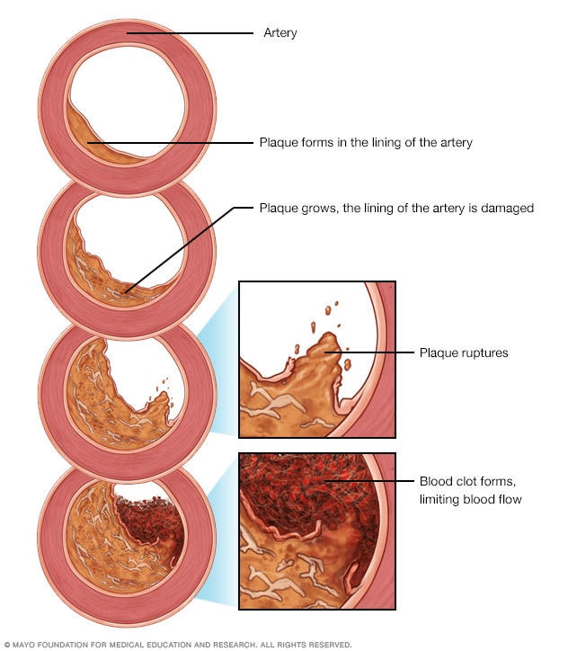
Coronary artery disease (CAD) is the narrowing or blockage of the coronary arteries. This condition is usually caused by atherosclerosis. Atherosclerosis is the build-up of cholesterol and fatty deposits (called plaques) inside the arteries.
- Typical risk factors for CAD
- Age
- Body size (BMI)
- Blood pressure (systolic)
- Lipid metabolism (HDL cholesterol)
- Cigarette smoking (self-report smoking status)
Many comprehensive studies have identified risk factors for coronary artery disease (CAD). Yet, the total disease process is not fully understood, with 30-70 percent of CAD deaths not explained by established CAD risk factors.
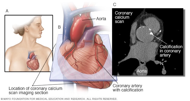
Coronary artery calcification (CAC) is part of the atherosclerotic process and predicts future CAD morbidity and mortality in asymptomatic and symptomatic adults.
Not every atherosclerotic plaque has calcification, but if calcification is present in the epicardial arteries it is almost always part of an atherosclerotic plaque.
Measures of CAC
Calcium volume score - It is calculated by multiplying the number of voxels with calcification by the volume of each voxel, including all voxels with an attenuation > 130 HU.
Agatston method - The Agatston method uses the weighted sum of lesions with a density above 130 HU, multiplying the area of calcium by a factor related to maximum plaque attenuation.
Relative calcium mass score - The relative calcium mass score is calculated by multiplying the mean attenuation of the calcified plaque by the plaque volume in each image, thus reducing the variation caused by the partial volume.
Research Hypothesis
Investigating the relationship between gender and coronary artery calcification (CAC) in asymptomatic subjects. In particular, we are interested in whether the rate of change is higher among male than female.
Materials and Methods
A retrospective study was performed on 217 asymptomatic subjects who underwent at least two EBCT studies for the detection of CAC. For the purpose of this study, asymptomatic was defined as having no history of documented ischemic heart disease including no abnormal electrocardiogram, stress test, or coronary angiogram, and no prior history of myocardial infarction or coronary bypass surgery. Standard EBCT acquisition protocols were followed and, from 30 to 40 contiguous axial images were obtained in a single breathhold to include the entire heart. Each study was scored for CAC volume using the default values of three or more contiguous pixels with density 130HU or greater in the expected location of an epicardial artery. The volume of each lesion was the product of the pixel area and the slice thickness. The sum of all lesion volumes yields the total calcium volume score (CVS) in units mm\(^3\).
Descriptive statistics
data <- read_dta("cac.dta")
data <- data %>%
  mutate(change_rate = (vol2 - vol1)/days) %>%
  mutate(rate_log = (log(vol2+25) - log(vol1+25))/days) %>%
  mutate(age_level = cut(data$age, breaks = seq(20,90,10)))
female <- data[which(data$sex == 0),]
male <- data[which(data$sex == 1),]

data %>%
  select(-c(nid, age)) %>%
  tbl_summary(
    by = sex,
    #statistic = list(c("vol1", "vol2", "days") ~ "{mean} ({sd})"),
    digits = all_continuous() ~ 1,
    missing_text = "(Missing)",
    label=list(change_rate~"vol change rate")
  ) %>% add_p(pvalue_fun = ~style_pvalue(.x, digits = 2)) %>%
  add_overall() %>%
  modify_header(label ~ "**Variable**") %>%
  modify_spanning_header(c("stat_1", "stat_2") ~ "**Grouped by gender**")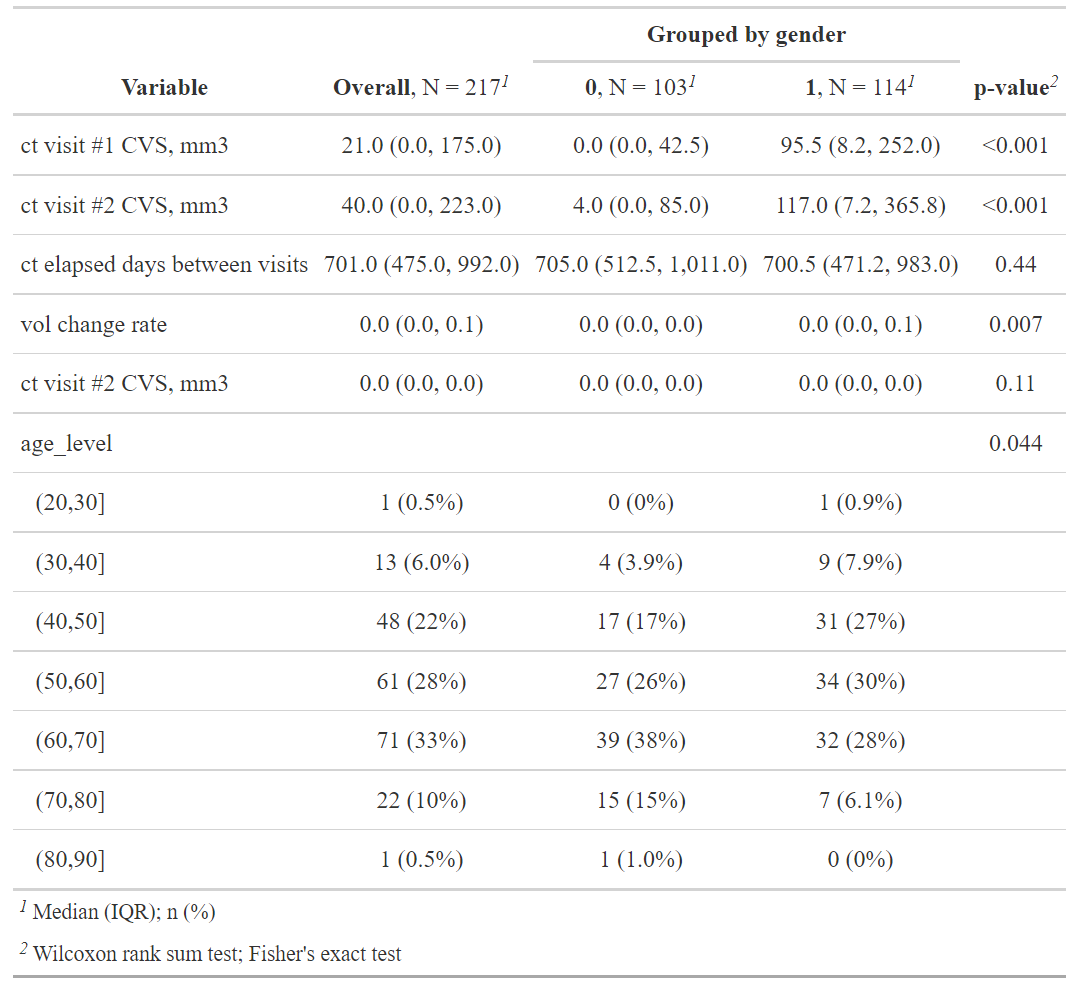
Note that we divided age by groups refering to previous research
- some plots
plot_ly(x = ~density(female$age)$x, y = ~density(female$age)$y, type = 'scatter',
        mode = 'lines', name = 'female', fill = 'tozeroy') %>%
  add_trace(x = ~density(male$age)$x, y = ~density(male$age)$y,
            name = 'male', fill = 'tozeroy') %>%
  layout(xaxis = list(title = 'Age'),
         yaxis = list(title = 'Density'))
plot_ly(x = ~density(female$days)$x, y = ~density(female$days)$y, type = 'scatter',
        mode = 'lines', name = 'female', fill = 'tozeroy') %>%
  add_trace(x = ~density(male$days)$x, y = ~density(male$days)$y,
            name = 'male', fill = 'tozeroy') %>%
  layout(xaxis = list(title = 'days'),
         yaxis = list(title = 'Density'))
plot_ly(x = ~density(female$vol1)$x, y = ~density(female$vol1)$y,
        type = 'scatter', mode = 'lines',
        name = 'female_vol1', fill = 'tozeroy') %>%
  add_trace(x = ~density(female$vol2)$x, y = ~density(female$vol2)$y,
            name = 'female_vol2', fill = 'tozeroy') %>%
  add_trace(x = ~density(male$vol1)$x, y = ~density(male$vol1)$y,
            name = 'male_vol1', fill = 'tozeroy') %>%
  add_trace(x = ~density(male$vol2)$x, y = ~density(male$vol2)$y,
            name = 'male_vol2', fill = 'tozeroy') %>%
  layout(xaxis = list(title = 'ct visit', type = "log"),
         yaxis = list(title = 'Density'))
plot_ly(x = ~female$vol1, type = "box", name = 'female_vol1') %>%
  add_trace(x = ~female$vol2, name = 'female_vol2') %>%
  add_trace(x = ~male$vol1, name = 'male_vol1') %>%
  add_trace(x = ~male$vol2, name = 'male_vol2') %>%
  layout(xaxis = list(title = 'ct visit chage rate', type = "log"))
plot_ly(x = ~density(female$change_rate)$x,
        y = ~density(female$change_rate)$y,
        type = 'scatter', mode = 'lines',
        name = 'female', fill = 'tozeroy') %>%
  add_trace(x = ~density(male$change_rate)$x,
            y = ~density(male$change_rate)$y,
            name = 'male', fill = 'tozeroy') %>%
  layout(xaxis = list(title = 'ct visit chage rate'),
         yaxis = list(title = 'Density'))
plot_ly(x = ~density(female$rate_log)$x,
        y = ~density(female$rate_log)$y,
        type = 'scatter', mode = 'lines',
        name = 'female', fill = 'tozeroy') %>%
  add_trace(x = ~density(male$rate_log)$x,
            y = ~density(male$rate_log)$y,
            name = 'male', fill = 'tozeroy') %>%
  layout(xaxis = list(title = 'ct visit chage rate'),
         yaxis = list(title = 'Density'))
plot_ly(x = ~female$change_rate, type = "box", name = 'female') %>%
  add_trace(x = ~male$change_rate, name = 'male') %>%
  layout(xaxis = list(title = 'ct visit chage rate'))
Model
# prepare data
df1 <- data %>%
  mutate(rate = (vol2 - vol1)/days) %>%
  mutate(rate_log_p1 = (log(vol2+1) - log(vol1+1))/days,
         rate_log_p5 = (log(vol2+5) - log(vol1+5))/days,
         rate_log_p10 = (log(vol2+10) - log(vol1+10))/days,
         rate_log_p20 = (log(vol2+20) - log(vol1+20))/days,
         rate_log_p30 = (log(vol2+30) - log(vol1+30))/days,
         rate_log_p40 = (log(vol2+40) - log(vol1+40))/days,
         rate_log_p50 = (log(vol2+50) - log(vol1+50))/days) %>%
  mutate(age_level = cut(data$age, breaks = seq(20,90,10))) %>%
  mutate(nid = as.factor(nid))
Preliminary Analysis
Firstly, We did a preliminary test to see the difference of rate of CAC progression between male and female. Since the discriptive statistics suggested that rate of CAC progression is not normally distributed, similar as Maher et al., we conducted Wilcoxon rank sum test to see the difference of rate of CAC progression between male and female.
wilcox.test(df1$rate[which(df1$sex==0)],
            df1$rate[which(df1$sex==1)], paired = FALSE)
Result presents that the rate of CAC progression is significant different between female and male groups (p = .007).
Linear model (original scale)
Study Sample
We analyzed all patients, including those who have a 0 CAC test score, since research suggested that patients with a zero CAC score may also develop cardiovascular events.
Measurement of Covariates
To avoid the potential nonlinearity relationship between age and CAC change rate, age was categorized with cut points selected empirically on the basis of past papers. Following shows how we grouped patients by age:
levels(df1$age_level)Then we constructed a linear model, adjusting for more risk factors. Following is the equation of the model,
(lm1 <- lm(rate ~ (age_level + days + sex + vol1)^2 , data = df1))where the rate is the change rate of CAS between two measurements (rate = (vol2 - vol1)/days). Patients’ age group, first time CAS and days between two tests were included as covariates in the model, and interactions of each pair of risk factor were also tested.
In order to arrive at a more parsimonious model, we simplified the model by a backward selection algorithm. The backward selection process started with all the candidate variables and sequentially removed variables to reach the best AIC value, beginning with the least significant variable.
model1 <- step(lm1, direction = "backward")
summary(model1)
As we can tell from the model summary, sex is proved to be associated with rate of CAC progression significantly (p = .018). Males are tend to suffer from a higher rate of CAC progression than females, when controlling other factors. We also found that there exists significant interaction effect between sex and age groups. Male aged from 50 to 60 are estimated to have a higher rate of CAC progression than Male aged from 20 to 30 (reference group). In addition, males with a higher first time CAS are more likely to have a lower rate of CAC progression. Results seems counter-intuitive.
check the goodness of fit
par(mfrow = c(2, 2))
plot(model1)
As for the model diagnostics, the residuals were left skewed heavily, conditional means did not follows a horizontal line, and variances were not constant. According to the plots in the descriptive statistics, possible reason could be heavily skewed for the rate of CAC progression.
Linear model (log scale)
Then we tried to process the data and do the follow up test. A common approach to deal with this problem is to exclude those with small values, say CAS<20. However, this would have resulted in exclusion of 108 (49.8%) participants. As suggested by Kronmal et al., we expressed change in CAS as the change from baseline to follow-up in the form of log CAS plus a constant, like log(vol2+20) - log(vol1+20). The constant was chosen to make change rate fairly symmetric and normally distributed. Following is the qq-plot that shows the distribution of CAS change rate, when we set different constants values.
.qqplot <- function(x, m){
  qqnorm(x, main = m)
  qqline(x)
}

par(mfrow = c(2, 4))
.qqplot(df1$rate,"original")
.qqplot(df1$rate_log_p1,"constant = 1")
.qqplot(df1$rate_log_p5,"constant = 5")
.qqplot(df1$rate_log_p10,"constant = 10")
.qqplot(df1$rate_log_p20,"constant = 20")
.qqplot(df1$rate_log_p30,"constant = 30")
.qqplot(df1$rate_log_p40,"constant = 40")
.qqplot(df1$rate_log_p50,"constant = 50")
As we can tell from the qq-plots, when constant value increases from 1 to 20, the distribution of change rate was significantly improved. Note that we also want to keep the constant value as small as possible, since a large constant value may weaken the difference among change rates too much. Thus, we finally set the constant value as 20.
Following is our new model. We also conducted backward selection here.
lm2 <- lm(rate_log_p20 ~
            (age_level + days +sex +log(vol1 + 20))^2, data = df1)
model2 <- step(lm2, direction = "backward")summary(model2)As we can tell from the model summary, sex seems not significantly associate with rate of CAC progression.
Then we check the goodness of fit
par(mfrow = c(2, 2))
plot(model2)
As for the model diagnostics, the residuals were left skewed sightly, conditional means follow a horizon and straight line, and variances were largely constant. Generally speaking, the model fitting was improved.
Conclusion
Based on the result of follow up test, we do not have sufficient evidence to prove that rates of CAC progression are different between male and female.
Inferential methodologies
Rumberger et. al suggested that a CAC score of less than 20 is likely to be associated with no or minimal luminal narrowing. Thus, we chose a CAC score of 20 at first scan run of follow-up was used as the cutpoint for selecting the study group. About one-quarter (109 of 217 = 50.2%) of the participants had a CAC score at first scan run of follow-up of 20 or more.
data %>%
  mutate(measure = vol1, time = 0) %>%
  select(-c(vol1, vol2, days, change_rate))

data_glm <- rbind(data %>% mutate(measure = vol1, time = 0) %>%
                    select(-c(vol1, vol2, days, change_rate)),
                  data %>% mutate(measure = vol2, time = days) %>%
                    select(-c(vol1, vol2, days, change_rate)))

keep_id <- unique(data_glm$nid[which(data_glm$measure >= 20 &
                                       data_glm$time == 0)])
length(keep_id)/length(unique(data_glm$nid))
data_glm <- data_glm[which(data_glm$nid %in% keep_id),]

ggplot(data = data_glm %>%
         mutate_at(vars(sex), function(x){ifelse(x==1, "male", "female")}),
       aes(x = time, y = measure, group = nid, color = sex)) +
  geom_point(size=2) +
  xlab("time (h)") +
  ylab("concentration (mg/l)") +
  scale_y_log10()+
  geom_line() +
  theme_bw()
we saw some differences between these profiles and presumed that these are not only due to the residual errors. Random effects for individuals may be considered.
To access the risk factors of CAC, Maher et. al(ref) built a generalized linear mixed model, which contains both fixed effects and random effects. In addition, other studies relating risk factors to quantity of CAC have used linear regression with log-transformed quantity of CAC (ln(quantity of CAC + 1)) in the whole heart from a single electron beam CT scan run as the outcome variable (ref1)(ref2)(ref3)(ref4). The use of mixed effects models will allow us to take into account this inter individual variability.
We build three candidate models. model0: linear model without random effects. model1: linear model with random effects. model2: linear model with random effects and a interaction term of sex and time. Note that we also took log of measures here.
model0 <- lm(log(measure) ~ sex + age_level + time, data = data_glm)
model1 <- lmer(log(measure) ~ sex + time + age_level + (1 | nid),
              data = data_glm, REML = F)
model2 <- lmer(log(measure) ~ sex + time + sex:time + age_level + (1 | nid),
              data = data_glm, REML = F)
Result interpretation
anova(model2, model1)
anova(model1, model0)
#plot(model2) #not sure need it or not
qqnorm(resid(model1))
qqline(resid(model1))

summary(model1)
Applied anova test to compared goodness-of-fit (deviance) between candidate models. We found that random effect is significant while interaction term is not. qq plot shows the model residuals are slightly skewed.
Experiment
# prepare data
df <- data
While the given data has only two measurements for each individual, a more sensible way to model the CAC progression is to use the mixed model, which include both fixed effect and random effect in order to capture the differences among the individuals.
One interesting experiment we would like to show here is the mixed model that we fit using the volume score itself as the dependent variable and the first measurement was used as a regressor. We would like to see the effect of gender from this mixed linear model.
First we used the ‘gather’ function to transform the data into long format such that each nid would have two records.
# Random effect model (can only be applied on vols, instead of rates)
df2 <- df %>%
  mutate(rate = (vol2 - vol1)/days) %>%
  gather('vol1', 'vol2', key = 'visits', value = 'vol') %>%
  mutate(sex = as.factor(sex))
  #mutate(rate = round(as.numeric(rate), 2))
df2[df2$visits == "vol1", "days"] <- 1
head(df2, 10)
Random model in this scenario:
model_mix1 <- lmer(vol ~ age + sex + days + (1|nid), data = df2)
fixef(model_mix1)
Limitations & Improvement
- Too little covariates took into account:
As introduced in the background section, the CAC progression is related to not only gender and age, but smoking history, life style, family history of heart problem etc. If we were able to fit a model that included more risk factors, the results could be different.
Also, we have got only one follow-up measurement for each patient. To fit a more rigorous model, one could use random effect model (which was suggested in many paper), at least two measurements at follow-up for each individual.
df4 <- df[which(df$vol1 > df$vol2), ]
summary(df4)- Among all the observations, 24 of them (11%) actually got a decrease in the calcium volume score, extra attention need be paid into those patients.
df4 %>%
  select(-c(nid, age)) %>%
  tbl_summary(
    by = sex,
    #statistic = list(c("vol1", "vol2", "days") ~ "{mean} ({sd})"),
    digits = all_continuous() ~ 1,
    missing_text = "(Missing)"
  ) %>% add_p(pvalue_fun = ~style_pvalue(.x, digits = 2)) %>%
  add_overall() %>%
  modify_header(label ~ "**Variable**") %>%
  modify_spanning_header(c("stat_1", "stat_2") ~ "**Grouped by gender**")
df5 <- df[which(df$vol1 <= df$vol2), ] %>%
  mutate(rate = (vol2 - vol1)/days) %>%
  mutate(rate_log = (log(vol2) - log(vol1))/days) %>%
  mutate(sex = ifelse(sex==0, "female", "male")) %>%
  mutate(nid = as.factor(nid))

lm_inc <- lm(rate ~ (age + days + sex + vol1)^2, data = df5)
model_inc <- step(lm_inc, direction = "both")
summary(lm_inc)
Supplemantery
Agatston method - The Agatston method uses the weighted sum of lesions with a density above 130 HU, multiplying the area of calcium by a factor related to maximum plaque attenuation: 130-199 HU, factor 1; 200-299 HU, factor 2; 300-399 HU, factor 3; and ≥ 400 HU, factor 4.
Therefore, the slice thickness and the interval must follow the original protocols in order to reduce the noise variation and, consequently, the maximum attenuation of the plaques, allowing the original published scores to be reproduced.
Calcium volume score - The calcium volume score has proven to be the most robust and reproducible method. It is calculated by multiplying the number of voxels with calcification by the volume of each voxel, including all voxels with an attenuation > 130 HU. However, this method is particularly sensitive to the partial volume (especially in plaques with high attenuation) and subject to variability between tests, depending on the position of the plaque in the axial slice acquired.
Relative calcium mass score - The relative calcium mass score is calculated by multiplying the mean attenuation of the calcified plaque by the plaque volume in each image, thus reducing the variation caused by the partial volume. The absolute calcium mass score uses a correction factor based on the attenuation of water.
(reference)
(reference)
(reference)
Why not use proportion change - When considering the percentage change in CAC, some points are highly influenced by very small baseline CAS. A very small absolute increase in CAC may result in a huge percentage increase.
